
Redesigning
greenscape website

Greenscape Inc. is a leading commercial landscaping company serving corporate clients across the U.S. Founded in 1987, the company has built a strong reputation through its commitment to sustainability and high-quality outdoor solutions. Despite their expertise in the field, Greenscape’s website failed to reflect the brand’s values and usability standards.
Our goal was to redesign the website to modernize its aesthetics, improve usability, and better serve a diverse range of users from clients and partners to job seekers and staff.
UX Research | UI Design | Prototyping | Evaluation
Main Users
-
Potential clients: Individuals or companies looking for landscaping and outdoor projects.
-
Current Customers: Customers who have already interacted with Greenscape for their services.
-
Employees: Staff members who may need access to internal information or updates.
-
Business Partners: Companies collaborating with Greenscape.
-
General Public: People interested in learning more about Greenscape, for research or general information.
Motivation
👁️ Visibility Issues
CTAs were not prominent and missing alt text affected accessibility
🧭 Poor Navigation Mapping
Users couldn't easily understand where they were on the site or how to navigate.
🎨 Outdated Aesthetics
Design lacked modern colors, fonts, and visual appeal expected by users.
💬 No Feedback Mechanisms
Lack of chatbot or form limited interaction and insights from potential customers.
🎯 Unclear Affordances
Clickable elements lacked visual cues, reducing overall user interactivity.
🧱 Inconsistent Layout
Design inconsistency created confusion and friction throughout the user journey.
Timeline
Week 1
Week 2
Week 3
Week 4
Week 5
Competitive Analysis
User Personas & Interview
Heuristic Evaluation
Prototyping
Evaluation
Competitive Analysis
Company
Market Share
Key Features
Strengths
Weaknesses
Gibbs Landscape Co.
12%
Lawn Care
Landscaping
Tree Services
Strong local presence
Detailed service pages
Professional photography
Outdated design
Poor mobile experience
Limited online booking
Bright
View

35%
Tree Care
Landscaping
Maintenance
Snow Removal
Corporate credibility
Comprehensive services
Strong brand recognition
Generic corporate feel
Complex navigation
Limited personalization
Lawns & Palms
18%
Residential & Pool
Landscaping
Garden Design
Vibrant visual design
Good use of imagery
Clear service categories
Cluttered layout
Slow loading times
Inconsistent branding
Reveal Design
Seattle Urban Farm

8%
5%
Landscaping Outdoor Living
Custom Design
Urban Farming
Landscaping Education
Premium positioning
High-quality portfolio
Sophisticated design
Unique niche focus Educational content Community engagement
Limited accessibility
High barrier to entry Complex contact process
Limited service scope Basic website functionality Poor SEO optimization
-
Gibbs Landscape Co.
Both Gibbs Landscape Co. and Greenscape exhibit high-quality images of landscaping projects; however, they differ in content presentation. Gibbs Landscape Co. features more text-rich content catering to users seeking in-depth information, while Greenscape adopts a more concise and visually vibrant approach.
-
BrightView
BrightView and Greenscape share vibrant color schemes and organized grid layouts. However, Bright employs larger header images that create a more impactful first impression, whereas Greenscape favors simplicity navigation with smaller header images.
-
Lawns & Palms
Both Lawns & Palms and Greenscape prioritize landscaping and maintain professional layouts. Lawns & Palms offers comprehensive guides for users seeking detailed insights, whereas Greenscape highlights visual content through images and videos of various landscaping projects.
-
Reveal Design
Reveal Design and Greenscape both feature clean layouts with straightforward navigation. Reveal Design places a strong emphasis on landscape design and construction services, showcasing detailed project approaches, while Greenscape engages users through interactive elements on its homepage.
-
Seattle Urban Farm Company
Both Seattle Urban Farm Company and Greenscape present clear and straightforward layouts; however, Seattle Urban Farm Company provides resources such as podcasts and books for urban gardeners, whereas Greenscape concentrates on commercial landscaping services and may lack the informational depth available on Seattle Urban Farm Company.
User Personas

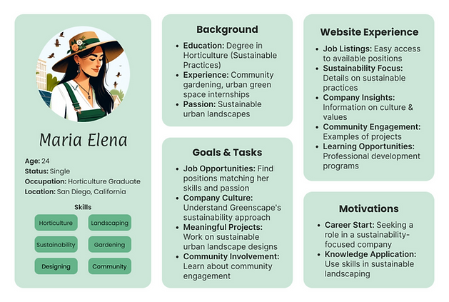
Interview Feedback
User Pattern 1:
-
Initial Impressions: Positive about neatness, readability, design, and color palette.
-
Issues: Search bar functionality confusion, challenges with zigzag layout, and overly long first page.
-
Task Performance: Found internships & storage locations easily, but struggled with landscaping/gardening tasks.
-
Overall Content: Viewed the site more as a portfolio than an informative platform.
-
Improvements Suggested: Enhance search bar, layout, navigation, and content presentation. Suggested dynamic navigation and index content for better user experience.
User Pattern 2:
-
Initial Impressions: Appreciated the visual appeal but noted visual overload from too many images.
-
Navigation: Rated 6/10, suggested more streamlined presentation and inclusion of user guides or chatbot.
-
Readability: Rated 7/10, with issues in font size and text contrast.
-
Visual Elements: Icons praised for clarity; white space needs better balance.
-
Memory and Learning: Found the layout intuitive but recommended tutorials for new users.
-
Technical Performance: Satisfactory load time & mobile optimization, but some features need improvement.
-
Improvements Suggested: More intuitive navigation, design consistency across pages, and highlighted "Available Positions" and "Meet the Leadership Team" page inconsistencies.
✓ Positive Feedback
-
Users appreciated the overall neatness and visual design
-
Color palette received positive feedback
-
Icons were praised for clarity and understanding
-
Users found internships and storage locations easily
-
Layout was generally considered intuitive
! Areas of Concern
-
Search bar functionality caused confusion
-
Zigzag layout presented navigation challenges
-
First page was considered overly long
-
Visual overload from too many images
-
Struggles with landscaping/gardening task completion
Heuristic Evaluation
Insufficient Input Validation on Forms
-
Forms accept numeric values in name fields, leading to data errors.
-
Severity: Major
-
Remedy: Implement strict input validation.
Inconsistent Job Highlighting
-
Inconsistent highlighting of job postings causes confusion.
-
Severity: Minor
-
Remedy: Standardize job listing presentation.
Lack of Immediate Assistance Options
-
Absence of a chatbot or help section impacts user experience.
-
Severity: Major
-
Remedy: Add chatbot or detailed FAQ.
Lack of User Control after Submission
-
Users can't review or edit their submissions, reducing control.
-
Severity: Major
-
Remedy: Allow confirmation step before final submission.
Hidden System Use Instructions
-
Essential instructions are not easily accessible.
-
Severity: Major
-
Remedy: Make instructions visible and easily accessible.
Limited Accessibility Features
-
Website does not fully support disabled users.
-
Severity: Catastrophic
-
Remedy: Implement WCAG guidelines for accessibility.
Overloaded Home Page Design
-
Home page clutter diminishes focus and efficiency.
-
Severity: Major
-
Remedy: Streamline home page content.
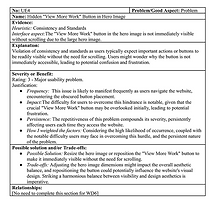
Hidden 'View More Work' Button
-
Important navigation button obscured by design elements.
-
Severity: Major
-
Remedy: Reposition or resize button for visibility.


Wireframe
1. Home Page and Navigation Bar: Selected to resolve the cluttered layout, improve navigation efficiency, and enhance user engagement by simplifying access to services and information.
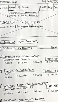
2. Job Page: Redesigned to make the job search more user-friendly and efficient, focusing on better navigation and easier access to job details, following feedback from competitive analysis.
3. Help Page: Introduced to provide direct and structured user support, filling a previously identified gap in user assistance and improving site usability.


Home Page Prototype

Help Page Prototype

Job Page Prototype

Evaluation
-
Participant Selection: Participants were selected based on their familiarity with similar websites or platforms, ensuring they could provide meaningful feedback. We aimed for a mix of demographics to capture diverse viewpoints.
-
Environment: The evaluations were conducted in a lab-based environment using desktop devices. This setup allowed participants to interact with the prototypes comfortably and provided a controlled setting for observation.
-
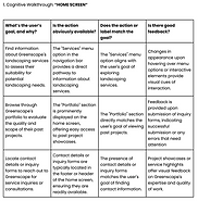
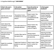
Cognitive Walkthroughs: Participants were guided through specific tasks designed to test different aspects of the prototypes. Tasks included finding a particular service, applying for a job, and accessing help resources. Participants were encouraged to think aloud, articulating their thought process and reactions as they navigated the prototypes.
-
Observation and Feedback: We closely observed participants' interactions and noted any difficulties or hesitations encountered. Feedback focused on ease of use, navigation intuitiveness, and overall user experience. Participants provided comments on what they liked, areas of confusion, and suggestions for improvement.


Feedback
-
Navigation Clarity: Participants highlighted the improved navigation in the prototypes of the website, noting that it was more intuitive and streamlined compared to the original site. They appreciated the clearer organization of content and the prioritization of essential features.
-
Usability Enhancements: Participants found the prototypes easier to use, with fewer instances of frustration or confusion. They appreciated the addition of features such as guided tours and job application tracking, which enhanced the overall user experience.
-
Design Consistency: Feedback regarding design consistency was positive, with participants noting improvements in visual aesthetics and the use of white space. Icons were generally well-received for their clarity and ease of understanding.