Redesigned a childcare center platform to enhance usability, implement validated forms, and streamline the ordering process, resulting in a 67% increase in task completion.
6 weeks
5 team members
UI/UX Redesigning
Target Users
The Penny Juice website is designed for directors, administrators, and staff at child care or nutrition centers responsible for selecting beverages for children. They play a key role in deciding what food and drinks are served, making it essential to address their needs and highlight the benefits of 100% blended fruit juice concentrate.
Critical Usability Issue
"The site accepts -5 as order quantity. That's a serious UX flaw that could lead to order processing errors."
Childcare Directors
Needs:
Reliable product quality and safety information
Wants:
Easy ordering, promotions, clear pricing
Nutrition Coordinators
Needs:
Nutritional information, clear ordering flow
Wants:
Intuitive UI, educational content, smooth navigation
Before UX 👎🏻

After UX 👍🏻

51%
Time Reduction
From 2m 45s to 1m 20s
50%
Less Scrolling
From 3+ to 1.5 lengths
67%
Task Completion
From 60% to 100%
Design Thinking Process
1
Empathize
We analyzed the existing Penny Juice site and identified critical usability issues affecting the user experience.
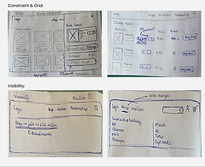
Grid Inconsistencies
The website's order form lacks a consistent grid layout, resulting in misaligned input fields.
Visibility Problems
The website's landing page lacks a clear and accessible navigation menu.
Constraint Issues
1. The order form allows invalid inputs like negative integers.
2. The submit button is active without all required fields filled.


2
Ideate: Divergent Thinking
Each team member created multiple design solutions, which we collaboratively evaluated and merged into wireframes.
Collaborative Process
• 20 total sketches from team members
• Voted on best ideas per section
• Focused on Home, Order, Cart & Checkout Page
Key Focus Areas
• User motivations and challenges
• Functional breakdown of each page
• Inclusive approach valuing diverse perspectives
Design Principles Applied
📐 Grid Systems - Consistency & Structure
👁 Visibility - User Navigation
🔒 Constraints - Input Validation
Sketches from everyone

.png)
.png)
.png)
3
Convergent Thinking
Each team member created multiple design solutions, which we collaboratively evaluated and merged into wireframes.
Home Page
-
Column Grid (Grid Concept): Chosen from User 1’s sketch for consistency across the site, creating an ordered, cohesive, and user-friendly layout.
-
Navigation Bar (Visibility Concept): Inspired by User 2’s sketch to improve visibility and allow access to all sections.
-
Logo Update: New green-and-white theme for cohesive branding.
-
Shopping Cart & Login: Added to enhance usability, making purchases and account management seamless.
Order Now Page
-
Breadcrumbs (Visibility Concept): From User 3’s sketch, helping users track their location on the site.
Cart Page
-
Golden Ratio Grid (Grid Concept): Based on User 4’s sketch for a balanced, aesthetically pleasing design.
4
Prototyping
We designed a user-friendly prototype for the Penny Juice website using convergent thinking approach.
 |  |  |
|---|
5
Testing
How our team conducted this stage
Preparation
-
Tasks were distributed among users in the target age group, covering a range of website interactions.
-
Usability criteria were defined for each task, focusing on efficiency, discoverability, complexity, user control, completeness, and exploration.
Testing Process
-
Each team member recruited a participant within the age range.
-
Participants were briefed on their tasks and asked to use the think-aloud protocol.
-
Users completed tasks on both the original website and the redesigned prototype.
-
The team recorded time, actions, feedback, difficulties, and completion success.
Observation and Analysis
-
Behavioral observations included hesitation, ease of navigation, and feedback.
-
Task completion times and user responses were compared between the original and redesigned versions.
Documenting Observations
-
Findings, timings, and feedback were documented for each task.
-
Usability criteria were applied to highlight strengths, weaknesses, and improvement areas in the redesign.
We conducted usability testing with 4 participants through task-based scenarios to identify any issues in the prototype.
User 1

Start by exploring the fruit products section and add a fruit juice to your cart. Next, remove one item, then return to the homepage and check for any ongoing healthy promotions.
User 2
.png)
Start on the homepage and look for any featured content. Then, browse the site to add two different juices to your cart, adjust the quantities, and move through the checkout process without placing the order.
User 3
Navigate to the product section and add five different fruit juices of your choice to the cart. After that, adjust the quantity of one juice before heading back to the home screen.
User 4
Explore the website to find and add three different types of juices (e.g., apples, oranges, and grapes) to the cart.
Quotes from the user during testing
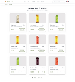
" I feel like I’m scrolling more when I am on the products page. "
" Why do I see fruit images when I came here to purchase juice bottles. "
" In most of the sites, the clickable buttons are highlighted when I hover over them. But, in this website, “Add” button is highlighted everywhere. "
6
Redesign based on Feedback
Our group successfully navigated the redesign process through feedback collection, brainstorming, collaborative decisions, testing, and finalizing. Key improvements included reducing cognitive load by reorganizing call-to-actions making the first button secondary and switching it to primary once selected and enhancing product clarity by replacing abstract images with actual product photos for easier recognition.
 |  |
|---|